Thursday, 29 September 2011

Crit 3: Louie Tong

Blog Address: http://louievtong.blogspot.com/


Louie's word was "rampification" that is - focusing on the use of ramps in architecture. His design had simple forms and space, it was based on the idea of stacking, squashing spaces together. He showed a lot of good development from his initial office space that was lazer cut, all of this was clearly shown to us during the crit. The coloured splatters and A1 drawing looked very good, and the video was well articulated and showed the development of his idea. If there was anything to improve on it would perhaps be making the location of the design on the site more obvious.

Crit 2: Matty Ryu (Kyun Je Yoo)

Blog Address: http://brucekid.tumblr.com/


Matty's A1 drawing showed A LOT of development and sketches about his design. I was quite impressed as to the extent that he sketched out every idea he had, it truely showed his mind at work, as coming up with ideas is a more fluid and messy process than just taking steps. His gifting was to life his building to a higher level. The studio plan was very flexible, allowing walls and storage items to be moved to accomodate requirements, it also made use of the void in between buildings on site. I especially liked the contrast of the white pastel on brown paper, and his extensive documentation of his ideas. An improvement could perhaps be on the justification of the form of the object, it goes from restricted to free form to restricted again without an explanation.

Crit 1: Kyle D'Mello

Blog Address: http://dmellok.tumblr.com/


Kyle's A1 drawing showed the development from his previous, lazer cut model of a studio. The original studio was based on the shape of a guitar/guitar pick. He used inspiration and ideas from architects such as Frank Gehry and Antoni Gaudi in order to explore biomorphic space. He had a lot of experiments showing a wide range of potential interior layouts, carefully considering the human response to the layout (by emphasizing the centre) There was also careful consideration to the needs of each individual as well as details such as the window locations, types and openings. I liked the idea of a blank wall in the informal meeting area to allow for projections. One thing that could be improved on could perhaps be larger drawings, showing the grander scale of the building.

4 Matrices

So I've been waiting a while to finally be able to put all 4 of the Matrix drawings together, one of the main reasons why I chose to use the same style for every drawing. Here they are, from left to right (up then down): Waking Up, Sustenance, Gathering and Gifting.

Wednesday, 28 September 2011

Photos on site

Here are a few photos photoshopped into the site, just showing the general orientation towards the Old Railway Station wall.


Matrix

Final model photos


Experimenting with perspex and more development

As per Anthony's suggestion, I had a bit of fun melting and bending perspex over a candle. I honestly didn't expect it would distort the way it did, and I've noted this technique for future reference.


Holding the perspex over the candle flame, unfortunately got a lot of black marks over it, but could perhaps be used stylistically.


Accidentally burnt a hole in it whilst looking for my camera.


A very interesting close up photo - my favourite of the lot.

Despite the fun I had experimenting with perspex, I did not feel it would add to my design, as perspex was only used as a rain cover, any more used would take away from the main feature of the cork. However, upon trying various ways to position this perspex around my design, I thought of different places I could add cork to emulate "growth"


This was my first attempt at adding growth to the structure, however, I felt it was such a small detail and took away from the soft curves of the weave around the columns, therefore I tried other positions, finally coming to the front of the stop. After an earlier critique that the cut off was too abrupt for so organic a form, I felt extending the roof as a tram track shelter would bring the stop closer to the existing architecture, showing a more developed "growth." Here are some photos of the process until I found a shape/weave/structure I liked:


Finally, I finished the extension, it emulates the existing roof whilst coming closer to the existing lichen filled wall and still gives the interesting effect in the interior that I liked so much. (Though you have a much more limited view than before where it was so open, however, previous photos show the interior just fine.) This is the finished product:


Chatting with the tutors one last time before the crit

I talked with Roberta and Anthony about my final model - I couldn't physically bring it in because I was worried about the crowded bus/potential for it to break. I had some photos however. The feed back was very good, and they liked my development, weaving and also the repositioning of the tram stop and elimination of the stairs.

One thing they suggested I look at was perhaps improving on the very neat cut the stop makes against the existing tram. It could look more "overgrown" and reaching out. Growing like roots. Since the due date is so close, they don't expect going to the workshop (it would be too last minute) but they recommended some experiments. An idea was bending perspex by melting it above a candle, or even leaving it to bubble, making more abstract experiments like those which I began with.

I'm gonna have some fun with it, just to see whether it would add to my model, at this point my matrix is my priority.

For Thursday we need to have:
* Completed 1:50 mod demonstrating appropriate use of Laser cutter
* a clearly labelled and annotated group site plan showing the chosen route
* a clearly labelled and annotated personal site plan showing your stop location with micro-climate and site analysis data.
* a detail model of part of your design (if appropriate)
... * completed and up to date blogs with finished models and all process work
* matrix

Tuesday, 27 September 2011

Improvements to the model

I decided to improve on the stairs - the plain expanding foam model didn't relate very well to the actual model and stuck out like a sore thumb. Therefore, I used some spare blocks of MDF from the lazer cutter and "threaded" cork between the pieces to create this pattern on the stairs:


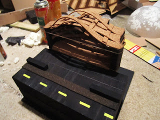
I also began working on the tram track/wall outside the Old Railway station model that will show my model in relation to existing space on the site. It is a section that includes the road outside the Old Railway Station, the wall (with a section removed to allow for easy movement from the tram to the station and the newly added tram track that would be utilizing the existing jutting platform.


The wooden block shows: (from left to right) the tram track, existing wall with section cut, footpath and yellow lines that are already located on the road outside of the Old Railway Station, seen here:


However, upon seeing the final model with the stairs and in relation to the site, I wasn't very happy with it. I then repositioned the stop model right against the track and it appeared much better. The stairs themselves and the idea behind them weren't very strong or well supported, whereas being on level with the tram track would be more conventional to actual tram tracks, whilst using less space and appearing far more aesthetically appealing.

The problem now was, how to position it? I came up with idea of raising the stop on pilotis, which would then have weaves around them, echoing the main structure/idea above it. The thin strips I first used looked to similar to the actual model, and took the attention away from it. I then tried one large strip but this looked unappealing. Finally, I split that large strip into two, then weaved them in opposite directions, the result was exactly what I wanted.


Then with the model sitting on top of it:


In relation to the existing architecture and new tram track.