Wednesday, 5 October 2011

Second Life, could it work?

I had an idea previously of trying to augment a Second Life picture, but wondering how to go about it in terms of perspective. I remember Judy suggesting that an augmented drawing of Second Life could be done in plan view, so I decided to try out my current, near final design:


And put it in plan form on Second Life, just to get the general shape/outline for the mapping process:


And then Photoshop it into the 1:500 aerial view courtesy of the GIS viewer:


I found this was quite useful in terms of figuring out measurements, as I wanted the measurements of each room to be accurate in terms of their relationship to each other, so a bit of re-sizing and changing of my presumed measurements were in order.

Talking with Judy, agreeing with what to present

I had a talk with Judy today about the strengths of my design, what I could improve on, develop further and what I would need to present during the final crit (along with that which is required on the brief)

I told her about the idea of stacking the office structure based on my 1:1 model, and she wasn't sure about the use of generic shapes, however I told her that my intention was not simply to have one box on another, but to rotate their angles so that the building would look more like an uno stack. The example I gave her was one from our Holiday Readings, by Chandavarker and Thacker:


 She suggested that in a design similar to this, I could explore the edges of the building (as they are so distinct when places on different angles) Perhaps these edges would be frayed, made of some perforated material?As well as how the various elements in the edge could come together. Furthermore, the colours that deign the different rooms in the building could be decided by the allocation of different types of material.

For the final crit, I am to present an A1 animation (this, I felt, was my weakest workshop and would like to re-do it) that is one minute long and shows my final design and it's various details and a lot of information. As well as this a model done in 1:100 scale that shows one part/section of my building, the interior and wall edges.

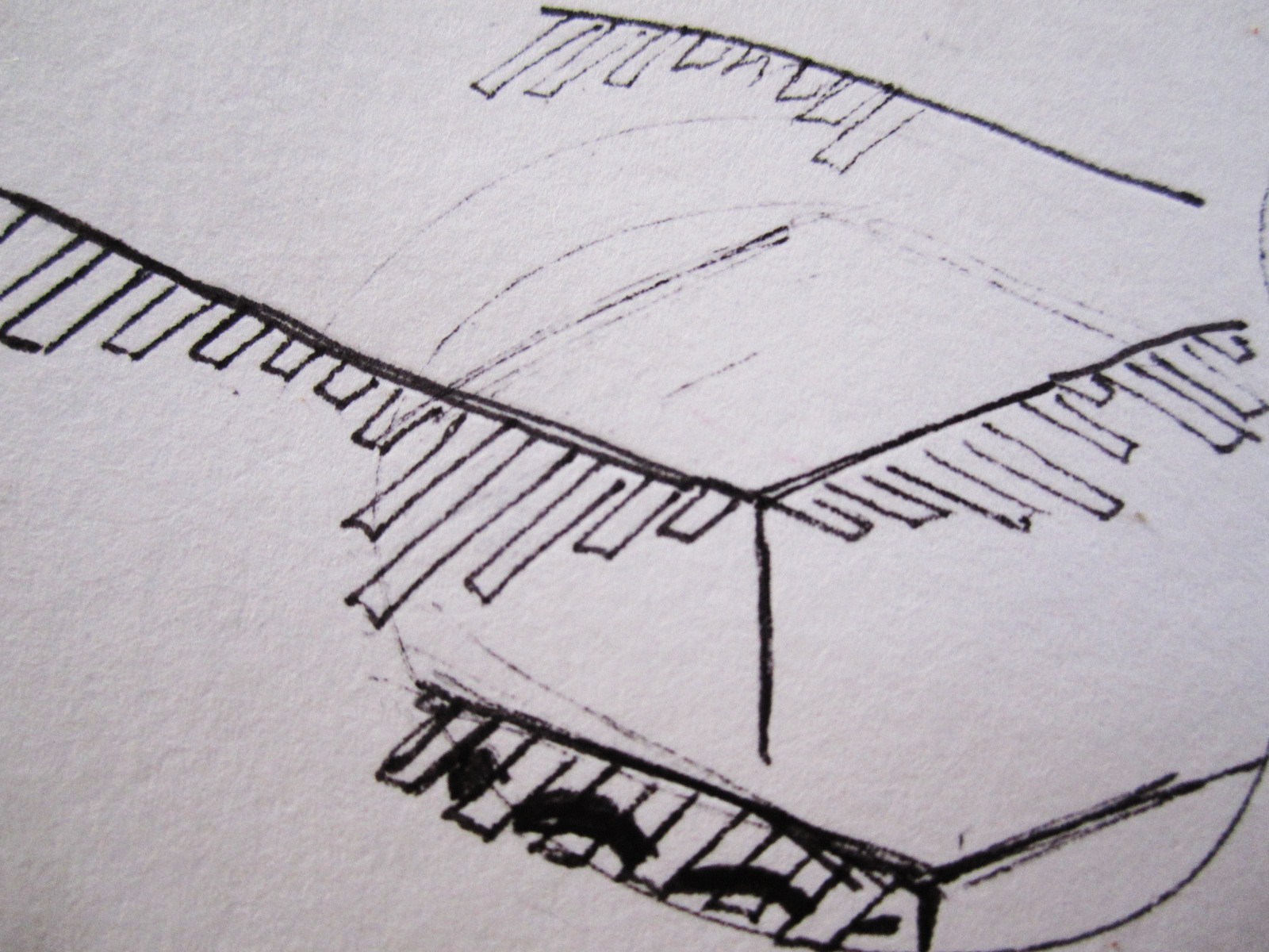
I did some sketches on both the form and the idea of a "frayed" edge:


I explored examples of architecture in Morocco, which are well known for detailing on the edges of buildings. Here are some examples:


I drew an example of how a detail such as this as would be incorporated into my design so far:


As interesting as this edge detail is however, I don't feel like it shows the abstract ripping/tearing and contrast with whole parts that I associate with fraying. Fraying for me, appears as something that was once whole but is coming of into pieces. My next drawing was using the "stick" idea Judy suggested, but following an inward/outward curve that would show a degradation/weathering of materials.


Finally, I tried a more hands on approach and began tearing at a piece of leftover cork with my craft knife. I was quite pleased with the result, as it cork is like a mix of fabric and a harder material such as MDF, it can be easily teared (like fabric) but still hold it's shape (like MDF) the details are also very small and appear very intricate:


  The strip showing evidence of my tearing with the craft knife, quite interesting since you don't know what pattern you will get.


Shown in relation to a thin strip of MDF, so that it is more evident how they would look in terms of being parts of the edge of the building. Since Judy broached the idea of how these pieces come together, I thought it would be best that they be layered. This was a technique I used in my lazer cutting design and I feel it served the design very well, as well as being visually appealing and allowing for a wide range of shapes to be made/mixes of material. With layering in mind, I then sought to see how the fraying cork would look with more on top of it:


With two layers:


With three layers! Much better


I really love the stacked effect of three of these sheets of cork, it not only evoke the idea of a frayed material but also harks back to my growth idea as they seem to be competing to grow outwards whilst being held back and fraying inwards.

Found a 1:500, now for 1:100

I finally found a 1:500 sectional model that shows my site (the parking lot in front of the Old Railway station) the model belongs to Sukshma Paranjpe and Sang Hun Lee, members of my design group, who kindly let me borrow it to take some photos.


Still struggling to find a 1:100 model that shows the front of the Old Railway Station, as everyone has moved their models to their lockers/home for safe keeping. If you're reading this and your 1:100 model includes the Old Railway station then please message me! :)

Tuesday, 4 October 2011

Sketches over site photos on photoshop

As a sort of digital version of augmented drawings, I used my tablet to freehand some sketches over site photos I have previously taken, so I can imagine how the building will look on site:


Sketches sketches sketches

I've identified the three things I find my best points in my designs so far (though this could change upon my meeting with the tutors and their opinion tomorrow) but I thought I'd make a start on how I could combine these three ideas into an office, (listed with the workshop they were thought up in) the ideas are:

- The use of cork as a material and the threading form/lazer cutting that goes with it. (Lazer Cutting)
- The melting of perspex (Lazer Cutting)
- The use of shelves/draws creating storage as well as informing the form/structure of the building.(Augmenting Reality)


Monday, 3 October 2011

Trying to flesh out ideas

I have quite a lot to go with at the moment, and it's getting hard to sift through it all in my head, so I tried some alternative forms of sketching to get my ideas "on the table" so to speak, and out of my head, so I can concentrate on what I specifically want to develop further.

Firstly, I began looking for the 1:500 and 1:100 models my group has as our "shared resource" however, most people (myself included) had either taken them home or put them in their lockers for safekeeping, with the result that only 3 models were in studio and none of them showed my site. So as an alternative, I went to see the models that other groups had, the closest one was that of Tania West and Ulysses Kim, which showed the park outside the Old Railway Station:


I did some experiments on the computer (admittedly on Sketch Up, but I wanted to be able to rotate the view of my previous office design)


I then made the design out of cardboard boxes that I had previously used to show the shelving idea of the wall section I did for the 1:1 workshop, and came across a previous experiment I did during the lazer cutting workshop where I was melting perspex over a candle, and I positioned it over the design to see how it would  work as a facade, as Judy indicated that my previous facade design (as influenced by my precedent study) would be something interesting to look at:


It looks almost like a Hadid or Gehry like roof structure, quite an interesting result that I hope I can incorporate into my more square shaped design. I also held it up to the light on a whim, and found the result was truely fascinating. I can imagine this as a light wall or something similar, as an office/studio space needs a large amount of natural light, both for physical and emotional comfort.

Updated map showing the services within a 10 minute walking distance


(Note that the circle showing an approximate 10 minute walking distance was carried out by me, which means it may fluctuate from person to person depending on walking speed.)

RED: Buses
GREEN: Food services
BLUE: Shopping facilities
YELLOW: Parking areas
PURPLE: Waiting spaces