And below is the new site, still incorporating the existing carpark and redesigning the area to benefit the community. The car parks taken up by the building (around 12) will be made up for by the new available tram. Also, the middle of my building, which is raised to recover lost ground, will align itself with the stairs coming up to the park, creating a passage for members of the community, rather than just a block sitting and obstructing access. The main access door of the upper floors (the client area, conference room etc) will be linked to the tram line by a bridge, floating above the ground of the site.
The new site is marked by red, the ground conditions and wind/light etc are exactly the same as the previous, due to their close proximity, however this new site offers a much better view of the park as well as several other advantages listed above.
Once I realized how this site was far more ideal for my design, I found that this put my previous 8 A4 drawings almost to waste, as they almost exclusively were drawings of the site at it's original position. (Except for the 1:500 plan and section and 1:200 plan and section) however, since these are to be considered "working drawings" I feel that I could not be truer to the word by showing my change of site as evidence of development and working, so rather than starting the A4s again, I can simply mark the changes, a far more effective sign of development than scrapping previous ideas.
I also had a discussion on what materials my "cork" would be in reality. I originally thought cedar, but came to a very interesting thought on the use of volcanic rock. The texture of the spray painted cork seems much more reminiscient of concrete or some form of stone, however, volcanic rock would be a more interesting material, since New Zealand is already a very volcanic country, rooting my design in it's actual location, using materials native to the land, rather than importing materials from distant countries, making it more site orientated. The volcanic rock would ideally be machine cut blocks of stone, in order to imitate the weathered edge of the roof design in the conference room.
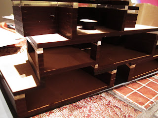
With only a few minor issues to deal with, I set about gluing my model (and finally getting rid of the heinous blu-tac) which was a process that took far longer than I expected, but I was very pleased to see how well my pieces came together, since the model was made of so many small components that needed to align quite precisely to accomodate the different angles/heights of the floor plans and inter-relating spaces.
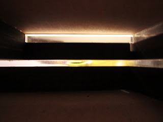
Photos of my model glued together, showing some interesting contrast under my dining room light, note that some aspects are still missing/have not been glued
With my model sorted, I am ready to set about the next requirement Judy gave me in our brief agreement - a one minute long A1 animation showing the final model. Although the sectional model was definitely ideal in showing the spaces and how they come together, several things aren't clear, such as the connection to the tram stop, specific relation to the site and the "other part" of the building, that is, the other part of the section model that is not visible. These are the three things I want to convey in my animation, as well as showing the movement throughout the building/exterior and how this would be interpreted by the community.
The other part of my building (the part not seen in the section drawing) shows the studio, conference room and workshop extended towards an atrium. This light filled atrium would be the height of the building but contain no floors, thus linking together the individual spaces in one "open space" that not only provides natural sunlight and a view but also looks aesthetically appealing. The atrium would have a space however, to still accomodate the passage underneath the building for the benefit of the community. Here is a sketch of the design to show how this would look (a much more refined, informative drawing will be present in the A1)


No comments:
Post a Comment