Tuesday, 18 October 2011

Final work

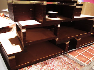
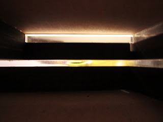
Here are some photos of my final model in various light situations:


As well as the final model photos:


And the sectional drawings (done in the style of one of my previous augmented reality drawings) that details both the effect of early morning light in the building and the access way/stair that leads to the bridge to the tram stop, showing the "gift to the community." (for some reason the blog automatically rotates these photos and doesn't allow me to change it back, inconvenient but I haven't managed to find a way around it.)


Some floor plan sketches done as "working drawings" in order to figure out details like the orientation in rooms such as the kitchen/bathroom and office details in the workshop/studio.

 First floor

 Second floor

 Third floor


Map showing the tram route and stops. The black circles are the office projects of my fellow colleagues.

The crit on the 17th October was very informative, I was given a lot of advice that could take my project further. This is an excert from my PDF file submission, the reflective sentence on how the crit went: "In summary, from my Final Crit I have learnt several things I could improve on in my design, as well as which points were strongest. In continuing with this design I would focus on blurring the clear boundaries of my materials, as well as exploring ideas such as the weaving of light and aspects of my building that could be cut out/be pulled out with more focus on the interior environment of the building. I was praised on my consideration of a wider context on the site, recognition of other elements, idea of spaces and the interesting architectural weight within the project. Further exploration would see this design even more integrated into the site and exploring its horizontality. No design is ever finished, not even when it is built, which is an important lesson I have learnt in Architecture so far."

Wednesday, 12 October 2011

Working, working, working

So as luck would have it, I appear to be coming down with something, definitely the worst time to get sick, but I've got until Friday to tough it out.

Since Monday it has been go go go in terms of getting things done, working on my model and finishing it up so I can do a proper A1 animation of the final design. In the A1 drawings I planned to show all the things not already visible in the model, that is, the light atrium, stair wells, other part of the building, accessway, relation to site and bridge to the tram track.

It took a lot longer to get the animation done than I thought, I chose not to go to design because of the long commute/more time I could have spent on the animation at home, which really paid off. In terms of accuracy I first lightly sketched the drawing (I chose to do an axonometric to show the most of the building and surrounding area) then went over it properly for animation purposes. It took two whole days but I finally have a product that I am very happy with, and have uploaded it to Youtube. I'm not too sure how I'm going to present the video to the crits on Monday, but I'll be bringing my laptop with me, just in case.

Here is the Youtube link:

http://www.youtube.com/watch?v=Fgqxkr1fxT0

Monday, 10 October 2011

Improvements to the design

After today's design session I came away with a lot of good points to add to my design to make it more effective. First of all, I had a few issues to contend with in terms of how the building relates to the existing retaining wall and how the tram track would run past/around this. I also lost the back of the building (something I quite like in the model) due to the back facing directly up against the wall. However, a solution presented itself simply by moving my design forward on the site. This is the original site (as indicated by the cross hatching section in the middle):


And below is the new site, still incorporating the existing carpark and redesigning the area to benefit the community. The car parks taken up by the building (around 12) will be made up for by the new available tram. Also, the middle of my building, which is raised to recover lost ground, will align itself with the stairs coming up to the park, creating a passage for members of the community, rather than just a block sitting and obstructing access. The main access door of the upper floors (the client area, conference room etc) will be linked to the tram line by a bridge, floating above the ground of the site.


The new site is marked by red, the ground conditions and wind/light etc are exactly the same as the previous, due to their close proximity, however this new site offers a much better view of the park as well as several other advantages listed above. 

Once I realized how this site was far more ideal for my design, I found that this put my previous 8 A4 drawings almost to waste, as they almost exclusively were drawings of the site at it's original position. (Except for the 1:500 plan and section and 1:200 plan and section) however, since these are to be considered "working drawings" I feel that I could not be truer to the word by showing my change of site as evidence of development and working, so rather than starting the A4s again, I can simply mark the changes, a far more effective sign of development than scrapping previous ideas.

I also had a discussion on what materials my "cork" would be in reality. I originally thought cedar, but came to a very interesting thought on the use of volcanic rock. The texture of the spray painted cork seems much more reminiscient of concrete or some form of stone, however, volcanic rock would be a more interesting material, since New Zealand is already a very volcanic country, rooting my design in it's actual location, using materials native to the land, rather than importing materials from distant countries, making it more site orientated. The volcanic rock would ideally be machine cut blocks of stone, in order to imitate the weathered edge of the roof design in the conference room.

With only a few minor issues to deal with, I set about gluing my model (and finally getting rid of the heinous blu-tac) which was a process that took far longer than I expected, but I was very pleased to see how well my pieces came together, since the model was made of so many small components that needed to align quite precisely to accomodate the different angles/heights of the floor plans and inter-relating spaces.


Photos of my model glued together, showing some interesting contrast under my dining room light, note that some aspects are still missing/have not been glued

With my model sorted, I am ready to set about the next requirement Judy gave me in our brief agreement - a one minute long A1 animation showing the final model. Although the sectional model was definitely ideal in showing the spaces and how they come together, several things aren't clear, such as the connection to the tram stop, specific relation to the site and the "other part" of the building, that is, the other part of the section model that is not visible. These are the three things I want to convey in my animation, as well as showing the movement throughout the building/exterior and how this would be interpreted by the community. 

The other part of my building (the part not seen in the section drawing) shows the studio, conference room and workshop extended towards an atrium. This light filled atrium would be the height of the building but contain no floors, thus linking together the individual spaces in one "open space" that not only provides natural sunlight and a view but also looks aesthetically appealing. The atrium would have a space however, to still accomodate the passage underneath the building for the benefit of the community. Here is a sketch of the design to show how this would look (a much more refined, informative drawing will be present in the A1)

Sunday, 9 October 2011

8 A4 drawngs

Here are my 8 A4 drawings that show various aspects of my site and design.

1:500


Plan


Section

1:200


Plan


Section

1:100


Plan


Section

1:20


Plan


Section

Progress on the final

So I haven't posted in a while, I've really been buckling down to get this model done by Monday evening so I can spend the next two days making a worthwhile, well done animation.

I met with Judy on Thursday and Ian right after. I got quite a lot of helpful advice on how to further my design using those cork panels previously mentioned. Instead of using them as the edges of the wall, I could use them as the actual wall or even the roof. The material that these cork pieces would represent in real life would ideally be a cedar wood (or an even harder type) that could be chopped/carved to produce the growth like edges on the cork.

I also thought about windows, and decided that windows on the edge would be ideal enough to let in light from all angles, but the main light source would be large panels of glass/frosted glass that face the park. These would let in the most ideal (and not direct) sunlight during that day, capturing the evening sun when the last few hours of sunshine are most needed to "extent the day" so to speak. This would also provide an excellent view of the park, as opposed to the neighbouring apartments or high walls.

In terms of how the "shelving cubes" came together in the design, I felt like they should promote interrelating spaces, that is, the floor plans would not be completely even, some rooms would be subtly higher than others, as well as having glass panels to allow views into other rooms on different levels, connecting them visually to those working inside. Ian suggested using the number 3 (the number of cork panels I brought in) to show a sequence or "time". I then did some sketches of how I'd like my structure to "grow" in one direction, whilst being ordered by three's. The floors are (roughly) split into three levels, and the individual rooms themselves are grouped into threes when viewed in plan (corresponding to their descending height, the tallest reaching to the higher wall surrounding the building, where the most human traffic travels from, that is, from Vector Arena to the Railway station)

I also wanted to stress length in my design, as the site on the carpark (though decently large, 12m x 45m) emphasizing length. I also left spaces in the design where it is "raised" off the ground in order to reclaim lost parts of the ground, as well as show the stacking/layering shelf idea (it would not all be flat on the ground.) I therefore wanted to focus on how to model these interrelating spaces and how they would appear in a section model. I started with a paper model of my design:


However, the paper wasn't helping me get an idea of how these heavier blocks would relate to each other, so I switched material to card, which was much better to contend with and helped me flesh out how each room (and it's allotted purpose) came together.


It was also exactly what I needed to figure out measurement and files for the lazer cutter, as a drawing would not have shown me how these elements come together in real life. Like my previous tram stop design, I wanted to stack the MDF that came out of the lazer cutter as a "main base" for things that could grow or develop around/on top of my design. It would also echo the stacking of the shelves, ideally. The cardboard mock up was made to scale (1:100) which helped with making the illustrator files. I had to get this done by Friday as I was told the lazer cutters on Upper Queen St weren't open during the weekend. (Also, I was told the architecture lazer cutters were A. broken and B. overheating and burning materials, less than ideal) so after a late Thursday night I emailed them my files and picked them up on Friday.


I then put together the pieces to make my model (albeit temporarily, with blu-tac, as I didn't want to do anything as permanent as superglueing it when the tutors still hadn't seen it) and I noticed some pieces that didn't align as well as I hoped (which I expected, seeing as the "shelf boxes" were all at different angles to each other and the floor wasn't supposed to be even) but luckily it turns out the workshop on Upper Queen St is open during the weekend before crit week (hurray!) and I emailed them an extra file with extras that needed to be fixed, expecting it to be finished on Sunday but no, they finished within the hour. With that happy feeling I went about fixing my model.


I wanted two parts of my model to show the idea of growth (as Ian and I agreed that it was more important to show the interrelating spaces than make the whole building a metaphor for growth) Since the direction of the building increasing in height was towards the North point, I decided the rooms on the top would show some of my previously planned cork features. The roof of the conference centre and the wall on the North side of the studio area. As well as that, I used my idea of spray painting cork (noted in my blog a long while back) to show a texture that was reminiscent of the asphalt/concrete on the site, being predominantly two shades of black/dark grey (shown on my 1:200 sectional and plan diagrams) I placed the darker "cedar" panels on the parts of the building that would be deemed "service" areas, such as the bathroom and kitchen, whilst the grey areas would be places on those that are intended as areas for the "served" such as the studio and workshop.


(Photos of my model coming together)


Showing the different shades as designated by room purposes (ignore the grey on the top edge, that is just from the temporary MDF board I placed my building on to make it easier to move around)

I experimented with how to layer the cork pieces in a way that will cast interesting shadows and show the clients who enter the conference room a sort of growth formation on the ceiling, where the contrast of light and dark from the different light sources shows small chips and details that are different from each angle. My original idea was a no-go, as I realized it completely blocked the windows by building downwards. So instead I decided to go up, and layer the cork almost like a pyramid, but chip at it from both sides so it could be seen from the exterior and interior. Here are some of the experimental shots before I decided on the colour (black, as original cork would look tacky, in my opinion, on a final design) and with a square oculus.

Original playing around:


And once I fixed up the details, I took some more photos with the light positioned as coming from the main source (the large window that would be open to the park) I found my money shot:


And here is the view from the exterior:


As for the "cork wall" on the North facing point of the main studio area, I went back and forth between the idea of horizontal and vertical layering, and whether it should be visible from the interior and exterior. Finally, I decided on horizontal layering and weathering on both sides. Initially also plain cork, I spray painted it black and then quite liked the contrast gotten with very small pieces of plain cork visible once it had been chipped away with a craft knife. Here are some photos of the development and the end product shown on the interior and exterior:


Interior shot


Exterior shots

I have some more work to do, but I'm hoping that after talking to the tutors tomorrow I will be able to have everything ready/finished in terms of the model by Monday evening. I need it done this early so I can devote all of Tuesday and Wednesday and possibly some of Thursday, to a good quality A1 drawing and animation, and then the rest of Thursday to do a "stunning" matrix, whilst still going to my other lectures and other commitments. It's going to be a busy week, but I'm hoping my productive weekend will pay off.

Here are some parting shots of my model, front and back: